When most of us read a printed page, we usually pay attention only to the content and take the presentation for granted. But there is a lot that goes into a printed document, which begins with the actual lettering or typography.
This was the focus of Akurucon, an annual conference on Sri Lankan typography, which was held in Colombo early this month. This year’s conference specifically focused on the shared history of typography between Sri Lanka and the Netherlands.
The Netherlands?
While Sri Lanka has a centuries-long recorded history, until the printing press was introduced to the country by the Dutch in 1750, it was one written on ola palm leaf manuscripts. This was a system that involved inscribing letters on a small manuscript made from specially treated ola leaves with a metal stylus. The nature of the medium influenced the way that Sinhala letters were formed in this age. For example, there were no spaces between words and letters were very much rounded.
According to researchers like Kuipers & McDermott who wrote ‘Insular Southeast Asian Scripts’, these features that are common to cultures such as the Javanese and the Balinese, which have used palm leaf manuscripts, may have been adaptations to the leaf, as angular letters and stops were more likely to damage the leaf.
These letters would prove to be an obstacle for the Dutch administration after they took over control of regions of Sri Lanka in the 17th Century. To efficiently communicate their decrees, taxations and other government communiques, they needed to create large numbers of pamphlets for distribution in the native Sinhala and Tamil languages. Copying them out by hand was an arduous and time consuming task. That’s when they decided to try technology that was still new to the ‘East’, called the printing press.
Around the same time, Dutch missionaries who were interested in propagating Christianity in Sri Lanka by setting up schools and other educational institutions, realised they needed to print books in Sinhala. So, they too approached the Dutch government for assistance.
According to former government archivist J.H.O. Paulusz, “Many attempts have been made about 1720 onwards to set up a printing press for books in the Sinhala language, but the technical problems could not at first be overcome. However, in about 1725, the Superintendent of the Company, Arsenal Gabriel Schade, set to work again on experiments in casting the Sinhalese types and moulding the required parts.”
However it would not be until 1737, and two governors later, that Schade would be able to complete the preliminary work of printing in Sinhala. Dutch Governor Gustaff Willem Baron Van Imhoff (1736-40) states in his memoir, “Therefore the printing press established during my administration will be a useful instrument. Although it was only in May 1737 that a commencement was made with the type, yet already have been published a Sinhalese prayer book, a booklet in the same language for the instruction of those who wish to partake of the Lord’s Supper, catechisms in Mallabaar, and the four Gospels in Sinhalese.”
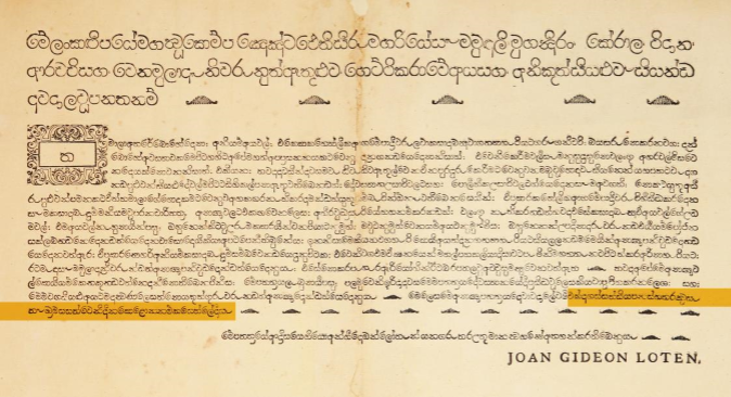
This first Sinhala book, ‘Singaleesch Gebeede-Boek’ was 40 pages long and contained the Lord’s Prayer, morning and night prayers, grace before and after meals, the 12 articles of the Creed and the Ten Commandments. The Dutch also printed various ‘plakkaat’, which could be translated as ‘placards’ in English, which communicated their various edicts and laws. Some of these have been preserved in the National Archives.
Archivist Paulusz acknowledged the sophistication of this early printing press. “It is agreed that the letters of the Sinhala alphabet should be so shaped that they bear the closest attainable likeness to pearls, then it must be conceded that the work of Schade in clearness and form surpassed the product of many a modern Press,” he said.
The emergence of Sinhala as a printed language influenced the way that the language is recorded. For example, while the rounded shapes of Sinhala letters was accurately carried over, as a result of justification—a typographic alignment that lines words up along the left margin—spaces between words were introduced to Sinhala as well. Over time, the period replaced the Sinhala kundaliya symbol to mark a full stop or end of a sentence.
Using these printed materials from over two centuries ago as an inspiration, a group of young Sri Lankan designers called Mooniak have created a new font for the digital age.
The Galle Font
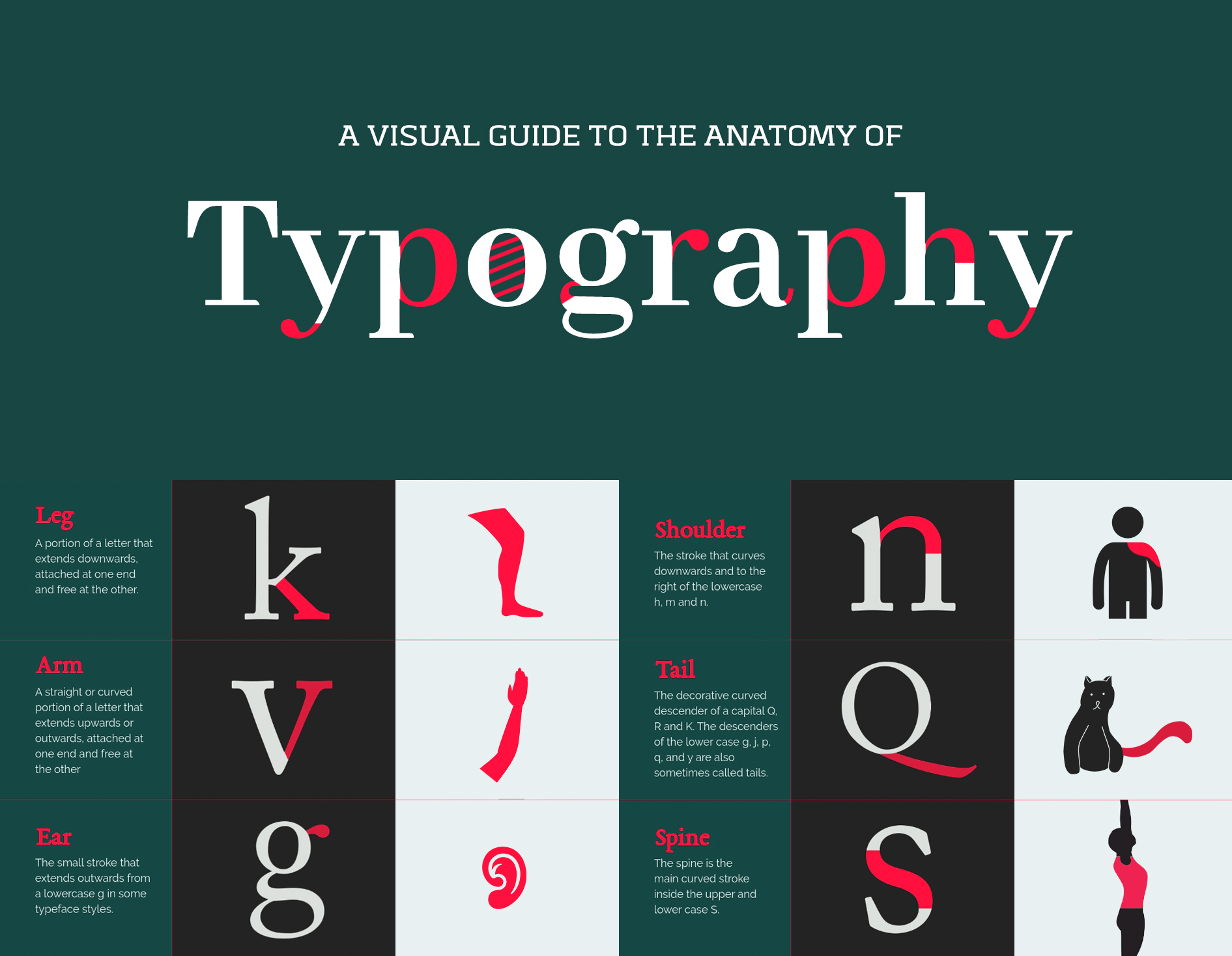
“Font” is a term that comes from typography. Simply put, it is a particular size and weight of a style of lettering. In printing, a font would be made from metal or wood, while today in the digital space, it is simply a file. As Pathum Egodawatta of Mooniak said, “A font is a mechanical system of writing. It is a way of mechanically, repetitively writing according to a prearranged scheme. In the digital space, a font is a software that does that.”
While digital typography in English has created numerous fonts for the English language, fonts for Sinhala have been few and far between, until the last few years.
Speaking to Roar Media, Egodawatta elaborated on how the project began around 2014, while they were creating fonts to be published on Google.
“Those days, the main problem that we encountered was a lack of knowledge and reference points. There were no fonts with Sinhala, Tamil and English anywhere. So the first thing we did was… to do research with old materials. We researched typography and how letters are shaped. Around the world, there is a lot of research done on linguistics but very little on typography or the shapes of letters, especially with languages like ours.”
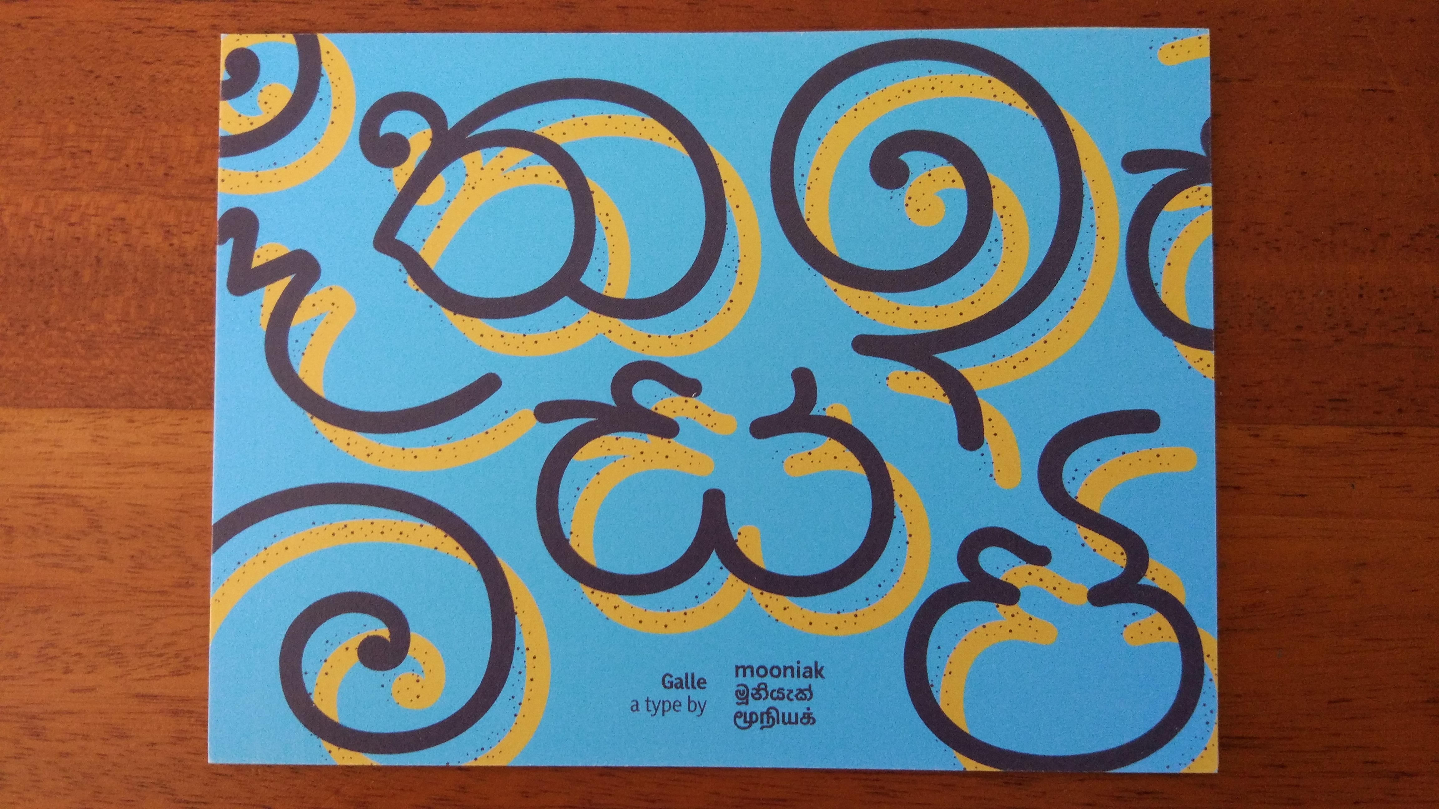
In the course of that research, they discovered the products of the Dutch Press. Intrigued by the peculiar shape of those early letters, they became interested in making a font based on those materials. “We started to look more into the background of these letters. Because instead of just tracing the letters and making a font, we wanted to do something with more substance. “
Around 2016, Janaka Attanayake was an undergraduate researcher under Dr Sumanthri Samarawickrama at the University of Moratuwa. At the time, Dr. Samarawickrama was researching for her PhD which led her to information on specific letter forms. Meanwhile, Attanayake initiated an independent revival of the Sinhala typeface, with Mooniak offering him production support.
When Egodawatta returned to Sri Lanka after his studies, he found that between him, Attanayake, Dr. Samarawickrama, and their colleague Kosala Senevirathne—who had conducted research on Sinhala numerals—they had all the information they needed about the Dutch Press to set up a proper project. It was then that they decided to look for funding and develop a fresh, modern font from the ground up, incorporating Sinhala, English and Tamil scripts.
“What we did next was to approach the Dutch Embassy for funding for this font project.” Egodawatta said. “So we started talking to [Dutch typographer] Martin Majoor about this around two years ago.” This was with the assistance of Akuru Collective, an organisation dedicated to inspiring interest in typography; the educational institute, Academy of Design, and Association Typographique Internationale, which is the global forum and focal point for the type community.
Before the public sessions at Akurucon, they spent three days with Majoor. They conducted research at the National Archives and looked at the materials from the Dutch Press, then started drawing sketches, making samples and developing it further. With the data and experience they got from that workshop, they created a brief and an action plan to create a modern font that has Sinhala, English and Tamil.
“The next move is to design this all over again from the very beginning,” said Egodawatta. “We are in that process now. The reason the font is marked alpha is that we want to make it clear that this is project that has not ended. That it’s only begun. The next step is the most exciting.”
Stumbling Blocks And Solutions
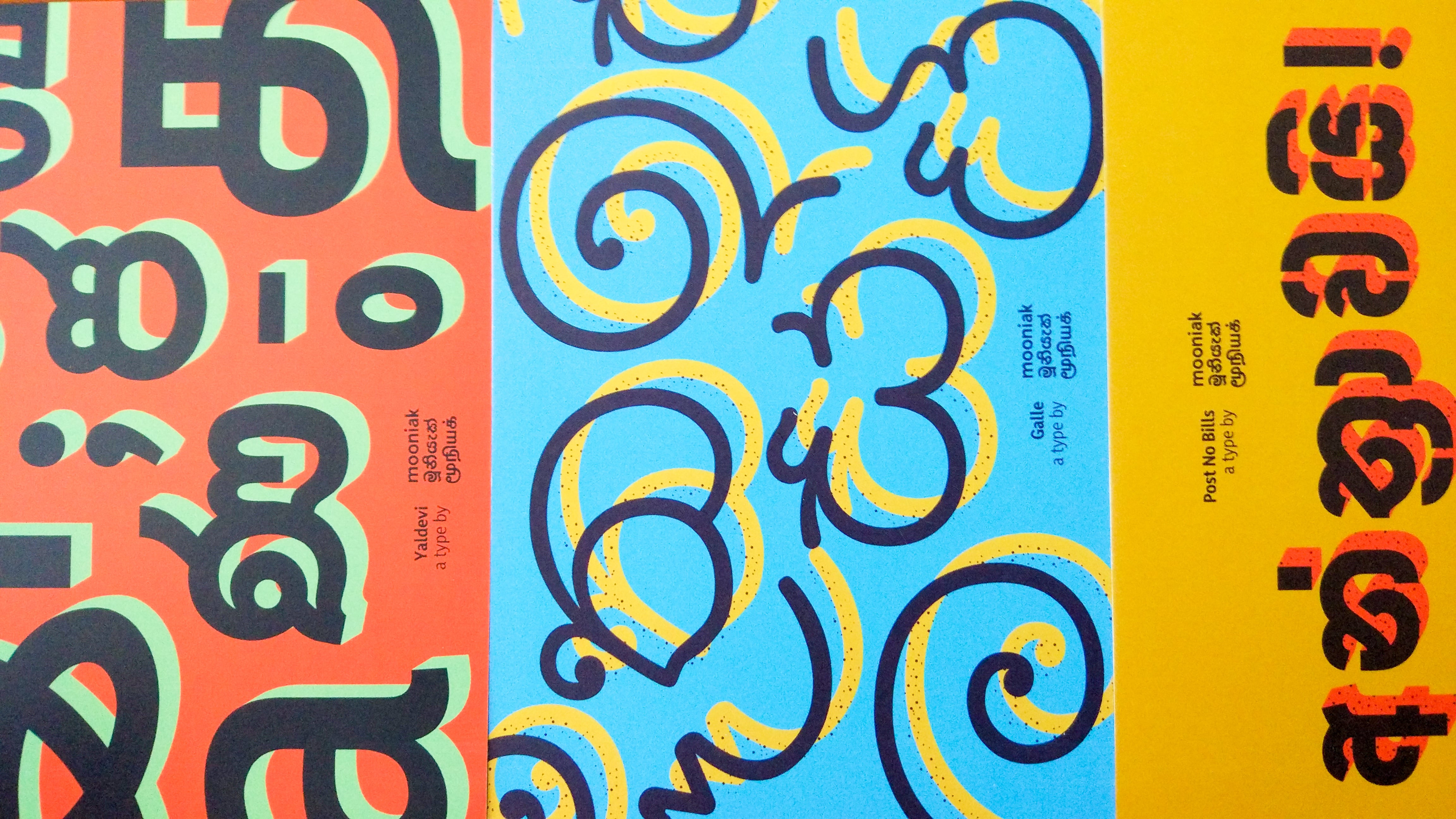
As Egodawatta wrote in 2015, there are a few problems preventing Sinhala and Tamil from being easy to use in the digital space. These include a lack of unicode and web font, a lack of good Sinhala (and Tamil) keyboards, and a dearth of knowledge on creating Sinhala fonts.
Building a Sinhala or Tamil font is not easy. Egodawatta explained, “To get, for example, a high quality Sinhala font, you must draw at least 300 unique characters or ‘glyphs’ as they are technically known. For example if you take the letter පි (pronounced pi) it has the ispilla (ි a diacritic that changes the pronunciation) over the ප (pronounced pa). We sometimes have to draw it as a completely new character because with the addition of the ispilla it gets too tall, so you have to draw the ප character shorter.”
As for the lack of knowledge on creating fonts, Egodawatta believes that for the most part, they have managed to overcome it. “All our knowledge is shared online, and we will give assistance and resources to anyone who asks us for help in building a font. We also plan to create a ‘Sinhala font incubator’ to give people who are interested in creating a font all the necessary resources, and maybe even create a font in six to seven months,” he said.
The work that Mooniak is doing is very important for Sri Lanka. While the digital revolution is touted as a great disseminator of knowledge, language still remains a stumbling block for those who do not speak the de facto language of the Internet: English. There is very little support for languages that do not communicate through the Latin script. Resources like the fonts that are being produced by Mooniak and others like them, which not only provide basic letters but also artistic forms and styles, are adding a new canon of knowledge to Sinhala and Tamil.
Cover Image: Dilshad Abdeen
